Palette direction
Use the Warm Spring direction to think about warmth, contrast, softness, and everyday neutrals.
Warm Spring palette
Last updated: May 3, 2026
Warm Spring usually points toward clear warm colors, cream, coral, golden yellow, grass green, and warm turquoise. colorfit.me helps you compare that direction against your own portrait and selected colors.
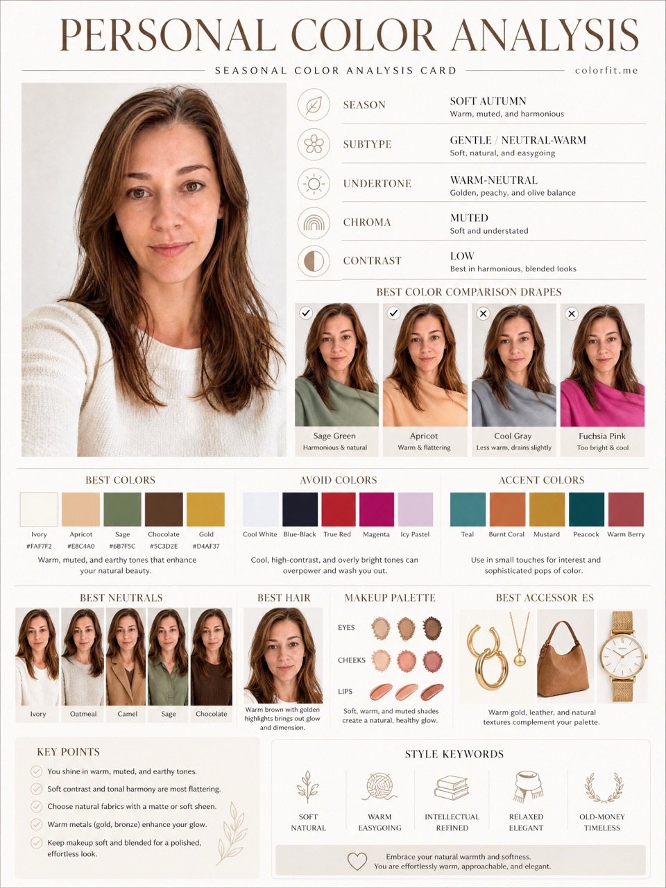
Short answer
Warm Spring usually points toward clear warm colors, cream, coral, golden yellow, grass green, and warm turquoise. colorfit.me helps you compare that direction against your own portrait and selected colors.
Use the Warm Spring direction to think about warmth, contrast, softness, and everyday neutrals.
The same palette can look different in clothes, hair, makeup, glasses, and jewelry, so the report separates those decisions.
Save the report before shopping and compare product photos against the visual board.
Questions
The AI report gives a useful direction, not a certified diagnosis.
Yes. Select six colors you are curious about before checkout.
Yes, the full report includes eight downloadable boards.
Ready when you are