Start with classic undertone checks
Look at vein color in daylight, hold white and cream fabric near your face, and compare yellow gold, silver, and rose gold side by side. Each clue can be wrong alone, but the pattern is useful.
Gold or silver jewelry test
Last updated: May 30, 2026
Should I wear gold or silver? Start with veins, white paper, and side-by-side jewelry, then use a photo-based AI test to compare gold, silver, rose gold, pearl, and accent colors near your face.
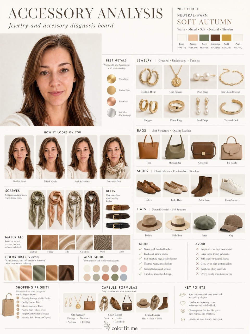
Jewelry sits close to your face, so the wrong metal can make skin look flat, gray, red, or yellow. This gold vs silver undertone guide helps you compare classic at-home tests and then turn the result into a practical six-color jewelry palette inside colorfit.me.
Short answer
Should I wear gold or silver? Start with veins, white paper, and side-by-side jewelry, then use a photo-based AI test to compare gold, silver, rose gold, pearl, and accent colors near your face.
Look at vein color in daylight, hold white and cream fabric near your face, and compare yellow gold, silver, and rose gold side by side. Each clue can be wrong alone, but the pattern is useful.
Fair skin is not always silver-friendly, deeper skin is not always gold-only, and olive or neutral undertones often need mixed metals, pearls, or rose gold. Judge whether the metal clears shadows and redness, not whether it matches a rule.
Choose the metal colors or jewelry finishes you are actually considering. The report turns gold, silver, rose gold, pearl, tortoise, and gem tones into a visual accessory board before you buy.
Before checkout
Do not treat "Gold or silver jewelry test before you buy." as an order to rebuild your entire wardrobe at once. Pick one real decision first: two tops in your cart, two hair-color ideas, a wedding guest dress, daily glasses, or a lipstick shortlist. The more concrete the purchase, the easier the result is to judge. A color that is theoretically flattering but never worn, bought, or placed near your face does not matter for the current decision.
Photo-based testing works best when you reduce variables. Use the same daylight front-facing portrait, the same makeup level, the same screen brightness, and compare colors within one category: light against light, deep against deep, cool against warm, clear against muted. That makes it easier to see what the color does to facial clarity, shadows, redness, and feature definition instead of reacting to pose, expression, or camera angle.
Color analysis has the highest impact near the face: tops, collars, scarves, coats, hair color, glasses, earrings, necklaces, and lipstick. If a color is difficult near your face, that does not mean it has to disappear from your life. Use it in pants, shoes, bags, belts, nails, or small prints. This keeps personal taste in the wardrobe while reducing the purchases most likely to make you look dull or tired.
A human stylist is still valuable for bridal styling, expensive wardrobe rebuilds, complex salon color, custom frames, or cases where you keep landing between two seasons. The AI report is meant to narrow direction quickly, create visual references, and reduce uncertainty before checkout. It is not a medical skin judgment, certified fabric draping session, or professional dye formula. Use it as a shopping screen, not an unbreakable rule.
After the test, do not only save the season label. Write down the three to five colors that looked most useful, the three colors most likely to cause mistakes, the neutrals that work near your face, the colors better used as accents, and the result of one real purchase. Review that note after two weeks, when the novelty has worn off. If a suggested color looks good in try-on photos, mirror checks, and a normal day out, it deserves a place on your default shopping list. If it only looks good on screen but still feels dull in real life, downgrade it to a small far-from-face accent.
Finally, compare the result with clothes you already own. Pull three pieces that reliably get compliments and three pieces that never feel right even though you like them on the hanger. Look at their warmth, depth, contrast, and softness. Often the strongest evidence is already in your closet; it simply has not been organized into a rule. The report should turn scattered hunches into repeatable buying filters, not pressure you to replace everything at once.
If one photo result contradicts years of real-life experience, retest with a cleaner daylight photo before changing your rules. Shadows, smoothing, filters, overexposure, heavy makeup, and dyed hair can all exaggerate errors. A recommendation is worth trusting when it appears consistently across several ordinary photos and one real purchase.
Comparison table
| Test | Gold may suit when | Silver may suit when |
|---|---|---|
| Vein color | Veins look more green or teal in daylight. | Veins look more blue or purple in daylight. |
| White cloth test | Cream or ivory softens shadows better than optic white. | Clean white brightens the face more than cream. |
| Jewelry comparison | Yellow gold makes the skin look warmer, calmer, and clearer. | Silver makes redness, yellowness, or shadows look less obvious. |
| Neutral or olive skin | Rose gold, muted gold, pearl, or mixed metals may beat bright yellow gold. | Soft silver, gunmetal, pearl, or mixed metals may beat bright chrome silver. |
Decision steps
Test your colors now
Upload a front-facing portrait and choose six colors first. The free result gives undertone, contrast, and a starter palette; if the direction is useful, unlock the full report with the same photo and palette.
Method
The report uses the uploaded portrait, six selected test colors, delivery language, and package type. It does not stop at a seasonal label; it turns the direction into visual boards for clothes, hair color, makeup, glasses, and accessories.
| Step | User input | Output |
|---|---|---|
| Free preview | Photo + six colors | Undertone, contrast, and limited direction |
| Mini report | Paid order + same portrait | Two core visual boards |
| Full report | Paid order + photo + selected colors | Eight boards across image, color, and styling decisions |
Questions
Try rose gold, pearls, muted gold, soft silver, or mixed metals. Neutral undertones often need use cases rather than one strict metal.
Yes. Upload a portrait, select six jewelry or accessory colors, and use the generated accessory board as a shopping reference.
No. Veins are only one clue. White cloth, side-by-side jewelry, contrast, hair depth, and the exact finish all matter.
Ready when you are