Use more than one test
Veins can look blue in one light and green in another. White paper can reveal yellow, pink, gray, or olive casts. Gold and silver jewelry show whether warmth or coolness looks cleaner near your face.
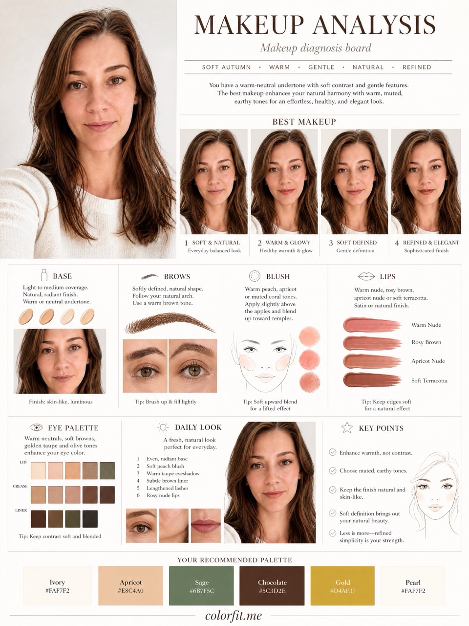
Skin undertone test
Last updated: May 30, 2026
A skin undertone test works best when you combine several clues: white paper, vein color, gold vs silver jewelry, foundation behavior, and real colors placed near your face.
Warm, cool, neutral, and olive undertones matter, but no single clue is reliable on its own. Use undertone as a shopping filter, then compare the exact colors you want to buy in makeup, hair color, jewelry, glasses, and clothing.
Short answer
A skin undertone test works best when you combine several clues: white paper, vein color, gold vs silver jewelry, foundation behavior, and real colors placed near your face.
Veins can look blue in one light and green in another. White paper can reveal yellow, pink, gray, or olive casts. Gold and silver jewelry show whether warmth or coolness looks cleaner near your face.
Fair skin can be warm, deep skin can be cool, and olive skin can read muted under bad lighting. The useful question is not just warm or cool, but whether the color makes your features clearer.
Use undertone to shortlist foundation, lipstick, metal tone, hair dye, and near-face clothing colors, then test the actual shades you are considering before checkout.
Before checkout
Do not treat "Skin undertone test for makeup, hair, and jewelry decisions." as an order to rebuild your entire wardrobe at once. Pick one real decision first: two tops in your cart, two hair-color ideas, a wedding guest dress, daily glasses, or a lipstick shortlist. The more concrete the purchase, the easier the result is to judge. A color that is theoretically flattering but never worn, bought, or placed near your face does not matter for the current decision.
Photo-based testing works best when you reduce variables. Use the same daylight front-facing portrait, the same makeup level, the same screen brightness, and compare colors within one category: light against light, deep against deep, cool against warm, clear against muted. That makes it easier to see what the color does to facial clarity, shadows, redness, and feature definition instead of reacting to pose, expression, or camera angle.
Color analysis has the highest impact near the face: tops, collars, scarves, coats, hair color, glasses, earrings, necklaces, and lipstick. If a color is difficult near your face, that does not mean it has to disappear from your life. Use it in pants, shoes, bags, belts, nails, or small prints. This keeps personal taste in the wardrobe while reducing the purchases most likely to make you look dull or tired.
A human stylist is still valuable for bridal styling, expensive wardrobe rebuilds, complex salon color, custom frames, or cases where you keep landing between two seasons. The AI report is meant to narrow direction quickly, create visual references, and reduce uncertainty before checkout. It is not a medical skin judgment, certified fabric draping session, or professional dye formula. Use it as a shopping screen, not an unbreakable rule.
After the test, do not only save the season label. Write down the three to five colors that looked most useful, the three colors most likely to cause mistakes, the neutrals that work near your face, the colors better used as accents, and the result of one real purchase. Review that note after two weeks, when the novelty has worn off. If a suggested color looks good in try-on photos, mirror checks, and a normal day out, it deserves a place on your default shopping list. If it only looks good on screen but still feels dull in real life, downgrade it to a small far-from-face accent.
Finally, compare the result with clothes you already own. Pull three pieces that reliably get compliments and three pieces that never feel right even though you like them on the hanger. Look at their warmth, depth, contrast, and softness. Often the strongest evidence is already in your closet; it simply has not been organized into a rule. The report should turn scattered hunches into repeatable buying filters, not pressure you to replace everything at once.
If one photo result contradicts years of real-life experience, retest with a cleaner daylight photo before changing your rules. Shadows, smoothing, filters, overexposure, heavy makeup, and dyed hair can all exaggerate errors. A recommendation is worth trusting when it appears consistently across several ordinary photos and one real purchase.
Comparison table
| Clue | What to look for | Shopping implication |
|---|---|---|
| White paper test | Yellow, peach, pink, gray, or green cast beside clean white | Helps choose cream vs optic white, warm vs cool makeup, and safer neutrals. |
| Vein color | Blue, purple, green, or mixed veins in daylight | Useful as a clue, but not enough to decide a season or metal tone alone. |
| Gold vs silver jewelry | Which metal makes the skin look calmer, clearer, and less shadowed | Use gold, silver, rose gold, or mixed metals as near-face accents. |
| Foundation behavior | Base turns orange, pink, gray, or flat after wear | Flags warm, cool, neutral, or olive corrections for complexion products. |
Decision steps
Test your colors now
Upload a front-facing portrait and choose six colors first. The free result gives undertone, contrast, and a starter palette; if the direction is useful, unlock the full report with the same photo and palette.
Method
The report uses the uploaded portrait, six selected test colors, delivery language, and package type. It does not stop at a seasonal label; it turns the direction into visual boards for clothes, hair color, makeup, glasses, and accessories.
| Step | User input | Output |
|---|---|---|
| Free preview | Photo + six colors | Undertone, contrast, and limited direction |
| Mini report | Paid order + same portrait | Two core visual boards |
| Full report | Paid order + photo + selected colors | Eight boards across image, color, and styling decisions |
Questions
No. Undertone is one input; seasonal color direction also considers depth, contrast, chroma, and how real colors behave near the face.
It can suggest olive-friendly visual directions, but use the result as a reference rather than a certified diagnosis.
Use gold vs silver as one test. Many people are neutral or mixed, so rose gold, pearls, or mixed metals may be more useful than a strict rule.
Ready when you are