Common undertone misreads
Yellow surface tone does not always mean warm undertone. Olive skin may look gray in pastel makeup, cool Asian skin may still tan golden, and neutral skin can swing warmer or cooler depending on hair color and lighting.
Asian skin color analysis
Last updated: May 30, 2026
Asian skin tones are not automatically warm. East Asian and Southeast Asian coloring can be warm, cool, neutral, olive, fair, medium, or deep, so the useful answer comes from undertone, contrast, and real color testing.
Search results often flatten Asian skin tone color advice into beige, warm, or golden rules. That misses people with cool porcelain skin, neutral beige skin, olive undertones, high-contrast dark hair, soft muted coloring, and deeper Southeast Asian skin tones. colorfit.me keeps the focus on visual shopping decisions instead of a fixed ethnic palette.
Short answer
Asian skin tones are not automatically warm. East Asian and Southeast Asian coloring can be warm, cool, neutral, olive, fair, medium, or deep, so the useful answer comes from undertone, contrast, and real color testing.
Yellow surface tone does not always mean warm undertone. Olive skin may look gray in pastel makeup, cool Asian skin may still tan golden, and neutral skin can swing warmer or cooler depending on hair color and lighting.
East Asian skin tones often get described as fair, beige, or porcelain, while Southeast Asian skin tones are often described as golden, tan, olive, or deep. Those labels are starting points, not palettes. Contrast and undertone still decide whether black, ivory, camel, silver, gold, coral, berry, or teal works near the face.
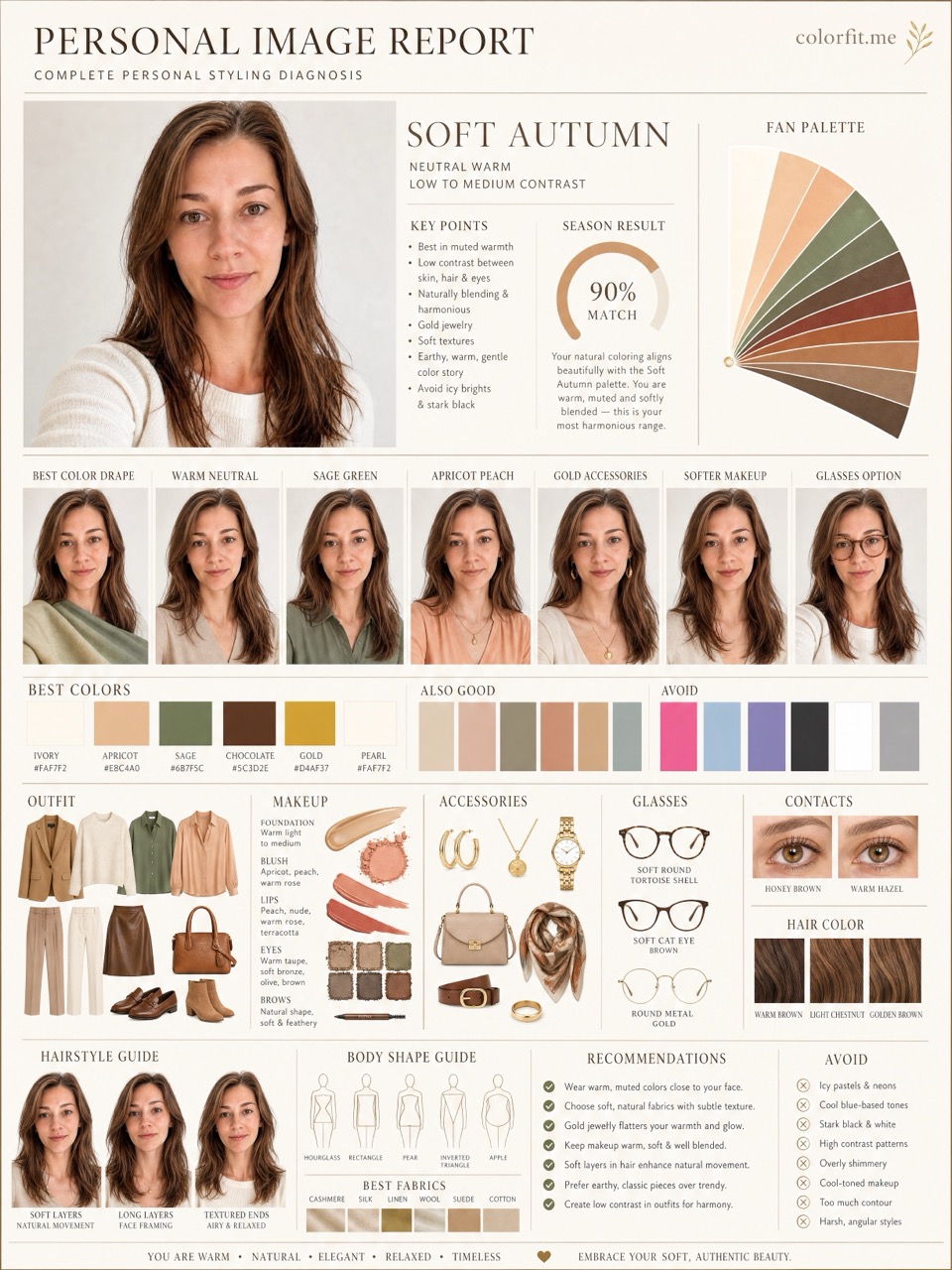
Choose colors you are already considering so the report can test them in clothing, hair, makeup, glasses, and accessories instead of giving generic seasonal color analysis.
Before checkout
Do not treat "Color analysis for Asian skin tones that avoids one-size-fits-all advice." as an order to rebuild your entire wardrobe at once. Pick one real decision first: two tops in your cart, two hair-color ideas, a wedding guest dress, daily glasses, or a lipstick shortlist. The more concrete the purchase, the easier the result is to judge. A color that is theoretically flattering but never worn, bought, or placed near your face does not matter for the current decision.
Photo-based testing works best when you reduce variables. Use the same daylight front-facing portrait, the same makeup level, the same screen brightness, and compare colors within one category: light against light, deep against deep, cool against warm, clear against muted. That makes it easier to see what the color does to facial clarity, shadows, redness, and feature definition instead of reacting to pose, expression, or camera angle.
Color analysis has the highest impact near the face: tops, collars, scarves, coats, hair color, glasses, earrings, necklaces, and lipstick. If a color is difficult near your face, that does not mean it has to disappear from your life. Use it in pants, shoes, bags, belts, nails, or small prints. This keeps personal taste in the wardrobe while reducing the purchases most likely to make you look dull or tired.
A human stylist is still valuable for bridal styling, expensive wardrobe rebuilds, complex salon color, custom frames, or cases where you keep landing between two seasons. The AI report is meant to narrow direction quickly, create visual references, and reduce uncertainty before checkout. It is not a medical skin judgment, certified fabric draping session, or professional dye formula. Use it as a shopping screen, not an unbreakable rule.
After the test, do not only save the season label. Write down the three to five colors that looked most useful, the three colors most likely to cause mistakes, the neutrals that work near your face, the colors better used as accents, and the result of one real purchase. Review that note after two weeks, when the novelty has worn off. If a suggested color looks good in try-on photos, mirror checks, and a normal day out, it deserves a place on your default shopping list. If it only looks good on screen but still feels dull in real life, downgrade it to a small far-from-face accent.
Finally, compare the result with clothes you already own. Pull three pieces that reliably get compliments and three pieces that never feel right even though you like them on the hanger. Look at their warmth, depth, contrast, and softness. Often the strongest evidence is already in your closet; it simply has not been organized into a rule. The report should turn scattered hunches into repeatable buying filters, not pressure you to replace everything at once.
If one photo result contradicts years of real-life experience, retest with a cleaner daylight photo before changing your rules. Shadows, smoothing, filters, overexposure, heavy makeup, and dyed hair can all exaggerate errors. A recommendation is worth trusting when it appears consistently across several ordinary photos and one real purchase.
Comparison table
| Situation | Possible misread | Better test |
|---|---|---|
| Fair East Asian skin | Assuming every light complexion is cool or delicate | Compare ivory, optic white, soft pink, clear blue, camel, and black near the face. |
| Golden or tan skin | Assuming every golden cast needs warm orange colors | Compare gold vs silver, coral vs berry, cream vs white, and warm brown vs espresso. |
| Olive Asian skin | Calling muted grayness dull instead of olive | Test softer neutrals, teal, deep berry, rose brown, and avoid overly chalky pastels. |
| High-contrast dark hair | Over-weighting skin tone and ignoring hair depth | Compare whether deep navy, black, emerald, or crisp white adds clarity or feels too sharp. |
Decision steps
Test your colors now
Upload a front-facing portrait and choose six colors first. The free result gives undertone, contrast, and a starter palette; if the direction is useful, unlock the full report with the same photo and palette.
Method
The report uses the uploaded portrait, six selected test colors, delivery language, and package type. It does not stop at a seasonal label; it turns the direction into visual boards for clothes, hair color, makeup, glasses, and accessories.
| Step | User input | Output |
|---|---|---|
| Free preview | Photo + six colors | Undertone, contrast, and limited direction |
| Mini report | Paid order + same portrait | Two core visual boards |
| Full report | Paid order + photo + selected colors | Eight boards across image, color, and styling decisions |
Questions
No. Asian skin can be warm, cool, neutral, olive, fair, medium, or deep. Surface yellowness is not the same as undertone.
It depends on undertone and contrast. Many people compare cream, gold, espresso, coral, teal, berry, silver, and deep navy before deciding.
Yes. The `/zh` version uses Chinese interface and report prompts, while English pages generate English report language.
Ready when you are