Built for decisions
The output is designed around real purchases: clothes, hair color, makeup, glasses, gold or silver jewelry, and styling mood. It helps you decide what to buy, not just what to call your season.
Online personal color analysis
Last updated: May 30, 2026
Personal color analysis online is most useful when it gives you a practical shopping reference: a photo check, selected colors, and visual boards you can compare with real purchases.
For $19, colorfit.me gives you a private order link and eight generated boards that work as a shopping and styling reference. Start with the free photo-based preview, then upgrade only when the photo and color direction feel useful.
Short answer
Personal color analysis online is most useful when it gives you a practical shopping reference: a photo check, selected colors, and visual boards you can compare with real purchases.
The output is designed around real purchases: clothes, hair color, makeup, glasses, gold or silver jewelry, and styling mood. It helps you decide what to buy, not just what to call your season.
The mini analysis checks whether your photo is usable, gives a limited direction, and lets you save a six-color palette before you continue to checkout.
Generated boards are connected to a signed order access link, can be reopened from the dashboard, and are not placed in a public gallery.
Before checkout
Do not treat "Personal color analysis online before you book a stylist." as an order to rebuild your entire wardrobe at once. Pick one real decision first: two tops in your cart, two hair-color ideas, a wedding guest dress, daily glasses, or a lipstick shortlist. The more concrete the purchase, the easier the result is to judge. A color that is theoretically flattering but never worn, bought, or placed near your face does not matter for the current decision.
Photo-based testing works best when you reduce variables. Use the same daylight front-facing portrait, the same makeup level, the same screen brightness, and compare colors within one category: light against light, deep against deep, cool against warm, clear against muted. That makes it easier to see what the color does to facial clarity, shadows, redness, and feature definition instead of reacting to pose, expression, or camera angle.
Color analysis has the highest impact near the face: tops, collars, scarves, coats, hair color, glasses, earrings, necklaces, and lipstick. If a color is difficult near your face, that does not mean it has to disappear from your life. Use it in pants, shoes, bags, belts, nails, or small prints. This keeps personal taste in the wardrobe while reducing the purchases most likely to make you look dull or tired.
A human stylist is still valuable for bridal styling, expensive wardrobe rebuilds, complex salon color, custom frames, or cases where you keep landing between two seasons. The AI report is meant to narrow direction quickly, create visual references, and reduce uncertainty before checkout. It is not a medical skin judgment, certified fabric draping session, or professional dye formula. Use it as a shopping screen, not an unbreakable rule.
After the test, do not only save the season label. Write down the three to five colors that looked most useful, the three colors most likely to cause mistakes, the neutrals that work near your face, the colors better used as accents, and the result of one real purchase. Review that note after two weeks, when the novelty has worn off. If a suggested color looks good in try-on photos, mirror checks, and a normal day out, it deserves a place on your default shopping list. If it only looks good on screen but still feels dull in real life, downgrade it to a small far-from-face accent.
Finally, compare the result with clothes you already own. Pull three pieces that reliably get compliments and three pieces that never feel right even though you like them on the hanger. Look at their warmth, depth, contrast, and softness. Often the strongest evidence is already in your closet; it simply has not been organized into a rule. The report should turn scattered hunches into repeatable buying filters, not pressure you to replace everything at once.
If one photo result contradicts years of real-life experience, retest with a cleaner daylight photo before changing your rules. Shadows, smoothing, filters, overexposure, heavy makeup, and dyed hair can all exaggerate errors. A recommendation is worth trusting when it appears consistently across several ordinary photos and one real purchase.
Comparison table
| Option | Best for | Tradeoff |
|---|---|---|
| colorfit.me | Fast shopping decisions, selected-color testing, downloadable boards | Not a certified in-person draping appointment. |
| Human stylist | High-stakes events, full wardrobe rebuilds, complex color correction | Higher cost, scheduling, and less instant experimentation. |
| Free apps or prompts | Curiosity and quick labels | Often less structured, less private, or built around subscriptions. |
Decision steps
Test your colors now
Upload a front-facing portrait and choose six colors first. The free result gives undertone, contrast, and a starter palette; if the direction is useful, unlock the full report with the same photo and palette.
Method
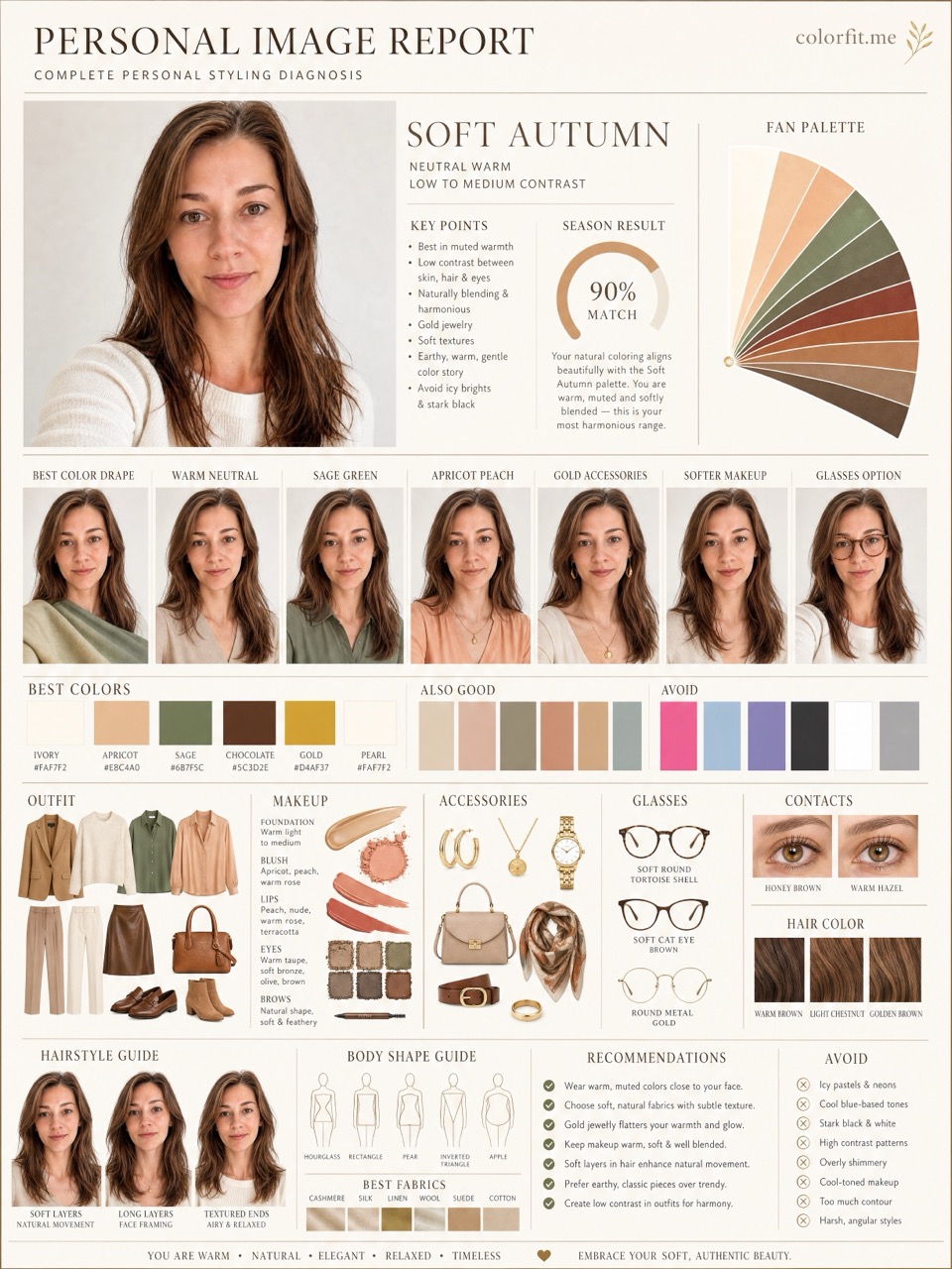
The report uses the uploaded portrait, six selected test colors, delivery language, and package type. It does not stop at a seasonal label; it turns the direction into visual boards for clothes, hair color, makeup, glasses, and accessories.
| Step | User input | Output |
|---|---|---|
| Free preview | Photo + six colors | Undertone, contrast, and limited direction |
| Mini report | Paid order + same portrait | Two core visual boards |
| Full report | Paid order + photo + selected colors | Eight boards across image, color, and styling decisions |
Questions
The full report includes eight 3:4 visual boards.
Yes. Keep the signed order link or sign in with the same email to recover it.
No. colorfit.me uses one-time payment for the chosen report package, not a weekly subscription.
Ready when you are