Soft autumn is muted before warm
Soft autumn usually looks best in softened colors: warm taupe, mushroom, moss, muted teal, dusty peach, and softened terracotta. If color is too orange, too yellow, or too bright, it can overtake the face.
Soft vs warm autumn
Last updated: May 30, 2026
Soft autumn vs warm autumn: soft autumn is muted first and warm second; warm autumn is warm first and can handle richer golden color.
Soft autumn vs warm autumn is one of the most common seasonal color confusions because both sit in the autumn family. Both often like warmth, softness, and earthy colors. The difference is priority: soft autumn needs muted, blended color; warm autumn needs visible golden warmth and can usually carry more saturation.
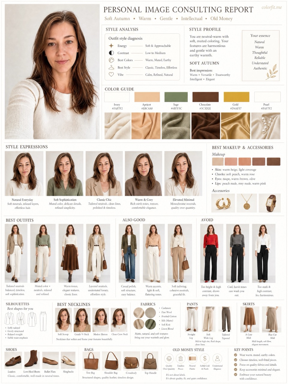
Short answer
Soft autumn vs warm autumn: soft autumn is muted first and warm second; warm autumn is warm first and can handle richer golden color.
Soft autumn usually looks best in softened colors: warm taupe, mushroom, moss, muted teal, dusty peach, and softened terracotta. If color is too orange, too yellow, or too bright, it can overtake the face.
Warm autumn usually handles camel, mustard, warm olive, copper, rust, pumpkin, golden brown, and warm ivory better. The face often looks healthier when the color has clear golden heat.
If you are between them, test mustard versus soft ochre, rust versus muted terracotta, camel versus taupe, and warm olive versus moss. The winner is the side that makes the face clearer, not the side that looks best on the hanger.
Before checkout
Do not treat "Soft autumn vs warm autumn" as an order to rebuild your entire wardrobe at once. Pick one real decision first: two tops in your cart, two hair-color ideas, a wedding guest dress, daily glasses, or a lipstick shortlist. The more concrete the purchase, the easier the result is to judge. A color that is theoretically flattering but never worn, bought, or placed near your face does not matter for the current decision.
Photo-based testing works best when you reduce variables. Use the same daylight front-facing portrait, the same makeup level, the same screen brightness, and compare colors within one category: light against light, deep against deep, cool against warm, clear against muted. That makes it easier to see what the color does to facial clarity, shadows, redness, and feature definition instead of reacting to pose, expression, or camera angle.
Color analysis has the highest impact near the face: tops, collars, scarves, coats, hair color, glasses, earrings, necklaces, and lipstick. If a color is difficult near your face, that does not mean it has to disappear from your life. Use it in pants, shoes, bags, belts, nails, or small prints. This keeps personal taste in the wardrobe while reducing the purchases most likely to make you look dull or tired.
A human stylist is still valuable for bridal styling, expensive wardrobe rebuilds, complex salon color, custom frames, or cases where you keep landing between two seasons. The AI report is meant to narrow direction quickly, create visual references, and reduce uncertainty before checkout. It is not a medical skin judgment, certified fabric draping session, or professional dye formula. Use it as a shopping screen, not an unbreakable rule.
After the test, do not only save the season label. Write down the three to five colors that looked most useful, the three colors most likely to cause mistakes, the neutrals that work near your face, the colors better used as accents, and the result of one real purchase. Review that note after two weeks, when the novelty has worn off. If a suggested color looks good in try-on photos, mirror checks, and a normal day out, it deserves a place on your default shopping list. If it only looks good on screen but still feels dull in real life, downgrade it to a small far-from-face accent.
Finally, compare the result with clothes you already own. Pull three pieces that reliably get compliments and three pieces that never feel right even though you like them on the hanger. Look at their warmth, depth, contrast, and softness. Often the strongest evidence is already in your closet; it simply has not been organized into a rule. The report should turn scattered hunches into repeatable buying filters, not pressure you to replace everything at once.
If one photo result contradicts years of real-life experience, retest with a cleaner daylight photo before changing your rules. Shadows, smoothing, filters, overexposure, heavy makeup, and dyed hair can all exaggerate errors. A recommendation is worth trusting when it appears consistently across several ordinary photos and one real purchase.
Comparison table
| Attribute | Soft Autumn | Warm Autumn |
|---|---|---|
| Main quality | Muted, blended, low to medium contrast | Warm, golden, medium richness |
| Best neutrals | Warm taupe, mushroom, soft navy, cocoa | Camel, warm beige, chocolate, olive |
| Best accents | Moss, dusty peach, muted teal, soft terracotta | Mustard, rust, copper, pumpkin, warm coral |
| White choice | Soft ivory or warm off-white | Cream, buttercream, warm ivory |
| Metal | Antique gold, brushed gold, bronze | Yellow gold, copper, bronze |
| Use carefully | Bright orange, neon coral, stark black | Dusty mauve, icy pink, blue-gray |
Decision steps
Test your colors now
Upload a front-facing portrait and choose six colors first. The free result gives undertone, contrast, and a starter palette; if the direction is useful, unlock the full report with the same photo and palette.
Method
The report uses the uploaded portrait, six selected test colors, delivery language, and package type. It does not stop at a seasonal label; it turns the direction into visual boards for clothes, hair color, makeup, glasses, and accessories.
| Step | User input | Output |
|---|---|---|
| Free preview | Photo + six colors | Undertone, contrast, and limited direction |
| Mini report | Paid order + same portrait | Two core visual boards |
| Full report | Paid order + photo + selected colors | Eight boards across image, color, and styling decisions |
Questions
Yes. Many people can borrow from both. The practical question is which side should dominate near your face.
Soft autumn is still in the autumn family, but it is more muted and can borrow some soft summer colors.
No. Warm autumn is richer and warmer than soft autumn, but it is not as bright as bright spring.
Soft autumn often likes soft chestnut, mushroom brown, and muted caramel. Warm autumn often likes golden brown, copper brown, and auburn.
Ready when you are