colorfit.me

12 season color test

What color season am I?

Last updated: May 22, 2026

What color season am I? Most people can narrow their season by checking undertone, depth, contrast, and chroma, then testing a few real colors near the face.

What color season am I? Start with four clues: whether your skin reads warm or cool, whether your overall coloring is light or deep, whether your features are high or low contrast, and whether clear or muted colors look cleaner on you. The 12-season system turns those clues into spring, summer, autumn, or winter subtypes, but a label is only useful if it helps you buy better clothes, hair color, makeup, glasses, and jewelry.

What Color Season Am I? 12 Season Test | colorfit.me
Sample board. Paid reports are generated from your portrait and selected colors.

Short answer

What does this page answer?

What color season am I? Most people can narrow their season by checking undertone, depth, contrast, and chroma, then testing a few real colors near the face.

Input
One front-facing portrait and six colors you want to test.
Output
Eight private, downloadable 3:4 visual report boards.
Best for
Shopping, hair color, makeup, glasses, and jewelry decisions.

Use the 12-season system as a decision tree

The four classic seasons are broad families. Spring usually means warm and clearer. Summer usually means cool and softer. Autumn usually means warm and muted. Winter usually means cool and higher contrast. The 12-season version splits each family into light, true, bright, soft, warm, deep, or cool subtypes so the advice is less generic.

Do not rely on one clue

Veins, eye color, hair color, and foundation shade can all mislead. A person with warm-looking hair can still prefer cool clothing. A person with visible blue veins can still have neutral or olive skin. The safer method is to combine several clues and then test actual colors you might buy.

Use a photo test before spending

Upload a clear portrait and choose six colors you are considering. colorfit.me turns those colors into a free mini-analysis first, then a paid 8-board report if you want visual pages for clothing, hair, makeup, glasses, accessories, and overall style.

Before checkout

Turn this result into real buying decisions.

Start with one concrete decision

Do not treat "What color season am I?" as an order to rebuild your entire wardrobe at once. Pick one real decision first: two tops in your cart, two hair-color ideas, a wedding guest dress, daily glasses, or a lipstick shortlist. The more concrete the purchase, the easier the result is to judge. A color that is theoretically flattering but never worn, bought, or placed near your face does not matter for the current decision.

Compare the same category with the same photo

Photo-based testing works best when you reduce variables. Use the same daylight front-facing portrait, the same makeup level, the same screen brightness, and compare colors within one category: light against light, deep against deep, cool against warm, clear against muted. That makes it easier to see what the color does to facial clarity, shadows, redness, and feature definition instead of reacting to pose, expression, or camera angle.

Separate near-face colors from far-face colors

Color analysis has the highest impact near the face: tops, collars, scarves, coats, hair color, glasses, earrings, necklaces, and lipstick. If a color is difficult near your face, that does not mean it has to disappear from your life. Use it in pants, shoes, bags, belts, nails, or small prints. This keeps personal taste in the wardrobe while reducing the purchases most likely to make you look dull or tired.

Know when to book a human stylist

A human stylist is still valuable for bridal styling, expensive wardrobe rebuilds, complex salon color, custom frames, or cases where you keep landing between two seasons. The AI report is meant to narrow direction quickly, create visual references, and reduce uncertainty before checkout. It is not a medical skin judgment, certified fabric draping session, or professional dye formula. Use it as a shopping screen, not an unbreakable rule.

Keep a small evidence log

After the test, do not only save the season label. Write down the three to five colors that looked most useful, the three colors most likely to cause mistakes, the neutrals that work near your face, the colors better used as accents, and the result of one real purchase. Review that note after two weeks, when the novelty has worn off. If a suggested color looks good in try-on photos, mirror checks, and a normal day out, it deserves a place on your default shopping list. If it only looks good on screen but still feels dull in real life, downgrade it to a small far-from-face accent.

Cross-check against your existing closet

Finally, compare the result with clothes you already own. Pull three pieces that reliably get compliments and three pieces that never feel right even though you like them on the hanger. Look at their warmth, depth, contrast, and softness. Often the strongest evidence is already in your closet; it simply has not been organized into a rule. The report should turn scattered hunches into repeatable buying filters, not pressure you to replace everything at once.

Do not overfit one bad photo

If one photo result contradicts years of real-life experience, retest with a cleaner daylight photo before changing your rules. Shadows, smoothing, filters, overexposure, heavy makeup, and dyed hair can all exaggerate errors. A recommendation is worth trusting when it appears consistently across several ordinary photos and one real purchase.

Comparison table

12 color season quick map

SeasonBest signsUse carefully
Light SpringLight, warm, fresh colors; peach, ivory, light aquaBlack, burgundy, heavy charcoal
Warm SpringGolden warmth, coral, grass green, warm turquoiseBlue-gray, icy pink, dusty mauve
Bright SpringClear warm brights, poppy, bright teal, crisp ivoryMuddy beige, soft gray, muted rose
Light SummerCool light colors, powder blue, lavender, soft roseOrange, black, heavy olive
True SummerCool, gentle, blue-based colors and soft navyRust, camel, tomato red
Soft SummerMuted cool-neutrals, dusty rose, blue-gray, sageNeon brights and strong black-white contrast
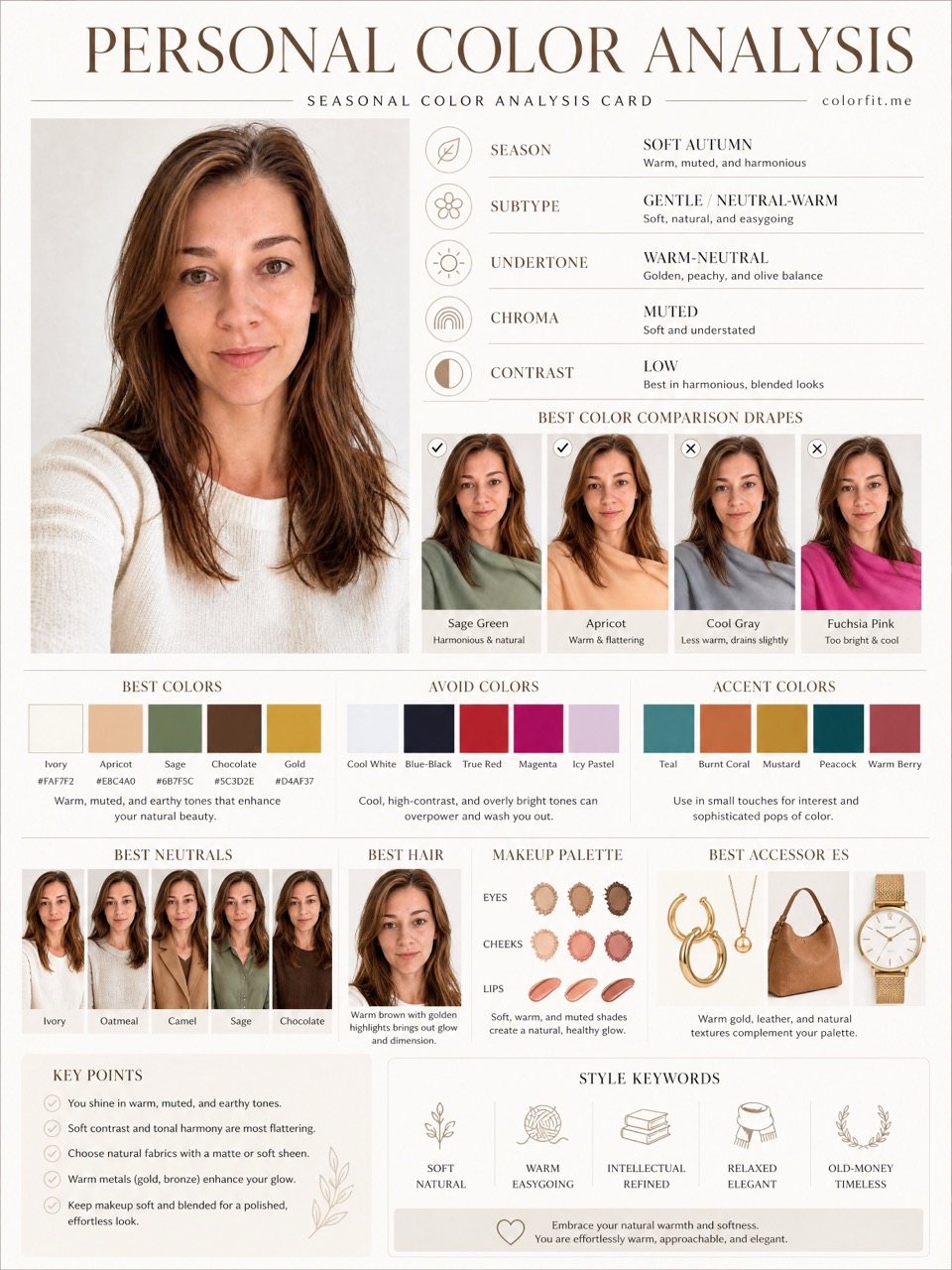
Soft AutumnMuted warm colors, moss, warm taupe, soft terracottaIcy colors, blue-based pink, stark white
Warm AutumnGolden warmth, camel, olive, rust, mustardCool gray, fuchsia, icy blue
Deep AutumnWarm depth, espresso, forest, aubergine, deep tealPastels and chalky light colors
Deep WinterCool depth, black, white, burgundy, pine, navyDusty beige and muted peach
True WinterCool high contrast, optic white, black, blue-redWarm camel, mustard, orange-brown
Bright WinterClear cool brights, hot pink, cobalt, emeraldSoft dusty colors and warm muted browns

Decision steps

Test this at home first.

  1. Check undertone Compare white paper, silver jewelry, gold jewelry, and a warm cream near your face. Look for skin clarity, not just personal preference.
  2. Check depth Ask whether light colors support your face or disappear, and whether deep colors sharpen you or overpower you.
  3. Check contrast Compare black-and-white contrast with softer tonal outfits. High contrast seasons usually tolerate stronger separation.
  4. Check chroma Compare a clear color with a muted version. Bright seasons look clearer in clean color; soft seasons look calmer in softened color.
  5. Test real colors Choose six colors from your cart, salon board, makeup drawer, or jewelry shortlist and run a photo-based mini-analysis.

Test your colors now

Run the free mini-analysis with a real photo.

Upload a front-facing portrait and choose six colors first. The free result gives undertone, contrast, and a starter palette; if the direction is useful, unlock the full report with the same photo and palette.

  1. Check undertone Compare white paper, silver jewelry, gold jewelry, and a warm cream near your face. Look for skin clarity, not just personal preference.
  2. Check depth Ask whether light colors support your face or disappear, and whether deep colors sharpen you or overpower you.
  3. Check contrast Compare black-and-white contrast with softer tonal outfits. High contrast seasons usually tolerate stronger separation.
  4. Check chroma Compare a clear color with a muted version. Bright seasons look clearer in clean color; soft seasons look calmer in softened color.
Open free mini-analysis Unlock the $19 full report

Method

How does colorfit.me turn a photo into useful guidance?

The report uses the uploaded portrait, six selected test colors, delivery language, and package type. It does not stop at a seasonal label; it turns the direction into visual boards for clothes, hair color, makeup, glasses, and accessories.

Step User input Output
Free preview Photo + six colors Undertone, contrast, and limited direction
Mini report Paid order + same portrait Two core visual boards
Full report Paid order + photo + selected colors Eight boards across image, color, and styling decisions

Questions

Check before checkout.

Can I find my color season from one photo?

A clear photo can narrow the direction, but one photo is not a certified diagnosis. Use it as a shopping screen and test real colors before buying.

What if I am between two seasons?

Many people sit near a border, such as soft summer and soft autumn. In that case, test the disputed colors instead of forcing a label.

Is undertone the same as color season?

No. Undertone is one clue. Season also considers depth, contrast, chroma, hair, eyes, and how colors behave near the face.

Why does colorfit.me ask for six colors?

The six colors make the report practical. Instead of only naming a season, it tests colors you may actually buy.

Ready when you are

Upload a photo, choose colors, and generate eight report boards after payment.

Test my color season