colorfit.me

Cool or warm undertone

Cool or warm undertone test

Last updated: May 22, 2026

Cool or warm undertone questions work best when you compare several clues: veins, white paper, gold versus silver, and how warm and cool colors change the face.

Cool or warm undertone test results are useful, but they are not the whole color analysis. Undertone affects foundation, lipstick, hair color, jewelry, and near-face clothing, yet a person can also be neutral or olive. The goal is not to win a quiz; it is to choose colors that make your face look clearer before you spend money.

Cool or Warm Undertone Test | colorfit.me
Sample board. Paid reports are generated from your portrait and selected colors.

Short answer

What does this page answer?

Cool or warm undertone questions work best when you compare several clues: veins, white paper, gold versus silver, and how warm and cool colors change the face.

Input
One front-facing portrait and six colors you want to test.
Output
Eight private, downloadable 3:4 visual report boards.
Best for
Shopping, hair color, makeup, glasses, and jewelry decisions.

Test 1: vein color

Look at wrist veins in indirect daylight. Blue or purple can suggest cool undertone; green can suggest warm undertone; mixed blue-green can suggest neutral or olive. This test is quick, but it is also the least reliable because skin depth, lighting, and vein visibility change the result.

Test 2: white paper

Hold plain white paper near a clean face in daylight. If skin looks yellow, golden, or peach beside white, warmth may be present. If skin looks pink, rosy, blue, or gray, coolness may be present. If the result looks confusing, you may be neutral or olive.

Test 3: gold vs silver

Compare simple gold and silver jewelry near the face. The better metal usually makes skin look smoother and eyes clearer. The less useful metal may make redness, sallowness, or shadows more visible. Rose gold and pearl are useful tie-breakers.

Before checkout

Turn this result into real buying decisions.

Start with one concrete decision

Do not treat "Cool or warm undertone test" as an order to rebuild your entire wardrobe at once. Pick one real decision first: two tops in your cart, two hair-color ideas, a wedding guest dress, daily glasses, or a lipstick shortlist. The more concrete the purchase, the easier the result is to judge. A color that is theoretically flattering but never worn, bought, or placed near your face does not matter for the current decision.

Compare the same category with the same photo

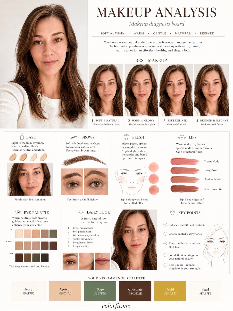
Photo-based testing works best when you reduce variables. Use the same daylight front-facing portrait, the same makeup level, the same screen brightness, and compare colors within one category: light against light, deep against deep, cool against warm, clear against muted. That makes it easier to see what the color does to facial clarity, shadows, redness, and feature definition instead of reacting to pose, expression, or camera angle.

Separate near-face colors from far-face colors

Color analysis has the highest impact near the face: tops, collars, scarves, coats, hair color, glasses, earrings, necklaces, and lipstick. If a color is difficult near your face, that does not mean it has to disappear from your life. Use it in pants, shoes, bags, belts, nails, or small prints. This keeps personal taste in the wardrobe while reducing the purchases most likely to make you look dull or tired.

Know when to book a human stylist

A human stylist is still valuable for bridal styling, expensive wardrobe rebuilds, complex salon color, custom frames, or cases where you keep landing between two seasons. The AI report is meant to narrow direction quickly, create visual references, and reduce uncertainty before checkout. It is not a medical skin judgment, certified fabric draping session, or professional dye formula. Use it as a shopping screen, not an unbreakable rule.

Keep a small evidence log

After the test, do not only save the season label. Write down the three to five colors that looked most useful, the three colors most likely to cause mistakes, the neutrals that work near your face, the colors better used as accents, and the result of one real purchase. Review that note after two weeks, when the novelty has worn off. If a suggested color looks good in try-on photos, mirror checks, and a normal day out, it deserves a place on your default shopping list. If it only looks good on screen but still feels dull in real life, downgrade it to a small far-from-face accent.

Cross-check against your existing closet

Finally, compare the result with clothes you already own. Pull three pieces that reliably get compliments and three pieces that never feel right even though you like them on the hanger. Look at their warmth, depth, contrast, and softness. Often the strongest evidence is already in your closet; it simply has not been organized into a rule. The report should turn scattered hunches into repeatable buying filters, not pressure you to replace everything at once.

Do not overfit one bad photo

If one photo result contradicts years of real-life experience, retest with a cleaner daylight photo before changing your rules. Shadows, smoothing, filters, overexposure, heavy makeup, and dyed hair can all exaggerate errors. A recommendation is worth trusting when it appears consistently across several ordinary photos and one real purchase.

Comparison table

Undertone clues

ClueCool leaningWarm leaning
VeinsBlue or purple in daylightGreen or olive in daylight
White paperSkin reads pink, rosy, blue, or graySkin reads golden, peach, yellow, or honey
JewelrySilver, white gold, pearl look cleanerYellow gold, bronze, copper look healthier
LipstickBlue-red, berry, mauve feel easierTomato red, coral, terracotta feel easier
Hair colorAsh brown, black-brown, cool burgundyGolden brown, copper, caramel, auburn

Decision steps

Test this at home first.

  1. Use daylight Avoid bathroom light, sunset light, and strong colored walls. Undertone tests fail quickly in tinted lighting.
  2. Remove obvious color casts Skip heavy foundation and strong lipstick. Pull bright clothing away from the face if it reflects color.
  3. Compare pairs Test silver versus gold, white versus cream, blue-red versus orange-red, and ash brown versus copper.
  4. Look for clarity Choose the side that makes the face look clearer, not the color you personally like most.
  5. Run a photo preview Use the six colors you are considering and check whether cool or warm options behave better in the mini-analysis.

Test your colors now

Run the free mini-analysis with a real photo.

Upload a front-facing portrait and choose six colors first. The free result gives undertone, contrast, and a starter palette; if the direction is useful, unlock the full report with the same photo and palette.

  1. Use daylight Avoid bathroom light, sunset light, and strong colored walls. Undertone tests fail quickly in tinted lighting.
  2. Remove obvious color casts Skip heavy foundation and strong lipstick. Pull bright clothing away from the face if it reflects color.
  3. Compare pairs Test silver versus gold, white versus cream, blue-red versus orange-red, and ash brown versus copper.
  4. Look for clarity Choose the side that makes the face look clearer, not the color you personally like most.
Open free mini-analysis Unlock the $19 full report

Method

How does colorfit.me turn a photo into useful guidance?

The report uses the uploaded portrait, six selected test colors, delivery language, and package type. It does not stop at a seasonal label; it turns the direction into visual boards for clothes, hair color, makeup, glasses, and accessories.

Step User input Output
Free preview Photo + six colors Undertone, contrast, and limited direction
Mini report Paid order + same portrait Two core visual boards
Full report Paid order + photo + selected colors Eight boards across image, color, and styling decisions

Questions

Check before checkout.

Can I be both cool and warm?

You can be neutral, neutral-warm, neutral-cool, or olive. Many people do not sit at a clean extreme.

Is gold or silver the best undertone test?

It is useful, but not enough alone. Combine it with white paper, color draping, and actual purchase colors.

Why do online undertone tests disagree?

Lighting, camera color, makeup, hair dye, and screen settings can all shift the result.

Does undertone decide my whole color season?

No. Undertone is one input. Season also needs depth, contrast, and chroma.

Ready when you are

Upload a photo, choose colors, and generate eight report boards after payment.

Test cool and warm colors